
I Don’t Design Logos. I Discover Them.
The most important part of the work is not drawing a logo. It is learning to recognise what is already there, and turning it into a sign that can represent a company.
Introduction
Every day, we see hundreds of logos. On the products we buy, on the websites we visit, on company signs and even on the most ordinary objects around us. Some of them we recognise immediately. Others disappear from our memory a few seconds later.
And yet, we almost always focus on the final stage of the process: the finished mark. Much less often do we ask ourselves where a logo actually begins.
In my experience, a logo does not begin the moment you open a graphics program. It begins much earlier. It begins with observation, listening and trying to understand what makes a company unique.
I like to think that ideas are already out there, floating in the air.
The designer’s role is not to invent them from nothing. It is to recognise them, give them shape and turn them into something that did not exist before.
I like to think that ideas are already in the air.
Drawing comes later.
Much later.
Contents
1. Why do we remember some logos and forget others?
2. Before I draw, I have to learn to see.
3. A sketch is not the result. It is a question.
4. Drawing means removing, not adding.
5. When a concept becomes a real solution.
6. A logo does not end when it is approved.
1. Why do we remember some logos and forget others?
Every day, we are surrounded by logos. We see them on products, cars, in shops, on websites, in the apps we use and even on the most ordinary objects. We probably notice hundreds of them without even realising it. And yet, only a few remain in our memory.
It is tempting to think the reason is simple. A good logo works. A bad one does not.
In reality, it is much more complex. A logo does not exist on its own. It lives alongside the company it represents, its products, its people, its services, its communication and the experiences that build up over time. It sits at the point where what a company is meets what people perceive. That is why the designer’s job is not simply to draw an attractive sign. It is to understand a reality and translate it into something simple, recognisable and coherent. The drawing is only the visible part of a much broader process.
2. Before I draw, I have to learn to see.
When a client asks me to design a logo, I do not start by thinking about colour, type or shape. I start by thinking about the company. Before drawing a single line, I need to understand who I am dealing with.
Every company has its own history, its own way of working, its own language, its own values and its own character that sets it apart from everything else. That is why the work almost always begins with a series of questions. Listening is the first real tool of design.
I want to understand how a product is made, how a company works, who the people behind it are and what it wants to communicate. I am not simply looking for information. I am trying to understand what makes that reality unique.
I like to think that ideas are already out there, floating in the air. They are not waiting to be invented. They are waiting to be recognised. The designer’s role is not to create something out of nothing. It is to observe carefully, connect what has been recognised and turn it into a simple, essential and coherent sign.
Only when that path becomes clear can I begin to draw. And then, the logo often seems almost to emerge by itself.
3. A sketch is not the result. It is a question.
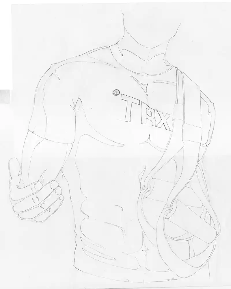
Once the context has been understood, the moment comes to put ideas on paper. For many people, this is where the project begins. For me, it is simply the beginning of the verification process.
Every sketch starts with a question. Does this shape really represent what I have observed? Does it fit the character of the company? Does it communicate the right message? Can it be recognised at first glance?
Sketches are not there to fill a page. They are there to explore possibilities. Some work. Others are discarded after a few minutes. And that is exactly how it should be.
At this stage, I am not looking for perfection. I am looking for answers. The more questions I can ask of the project, the fewer problems I will encounter later. That is why I never see a sketch as an unfinished drawing. I see it as a research tool. A simple, fast and remarkably effective way of testing whether an intuition really has the potential to become a distinctive and coherent visual sign.
4. Drawing means removing, not adding.
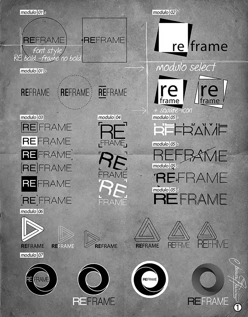
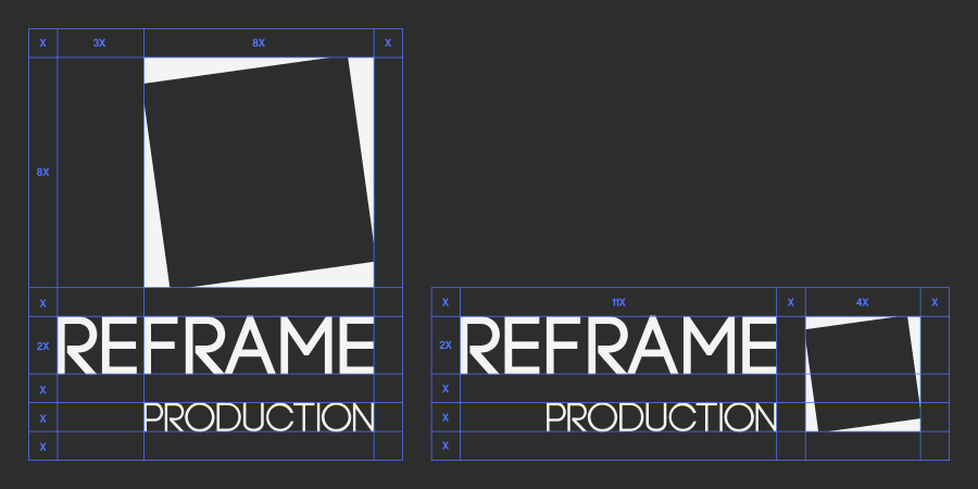
Once the concept has been chosen, a completely different phase begins. Many people think this is when the logo is created. In reality, the logo already exists. What changes is the level of precision. The sketch gives way to construction. Proportions are adjusted. Line weights find their balance. Typography is carefully selected. Every curve, alignment and space begins to have a specific reason.
At this stage, I work with vector graphics software. It could be Illustrator or any other tool. The software itself is not the important part. What matters is the refinement that takes place through it.
Designing a logo means removing everything that is unnecessary.
Every element has to contribute to making the mark clearer, more legible and more balanced. The final result often looks simple. And that simplicity is precisely what requires the most decisions.
5. When a concept becomes a real solution.
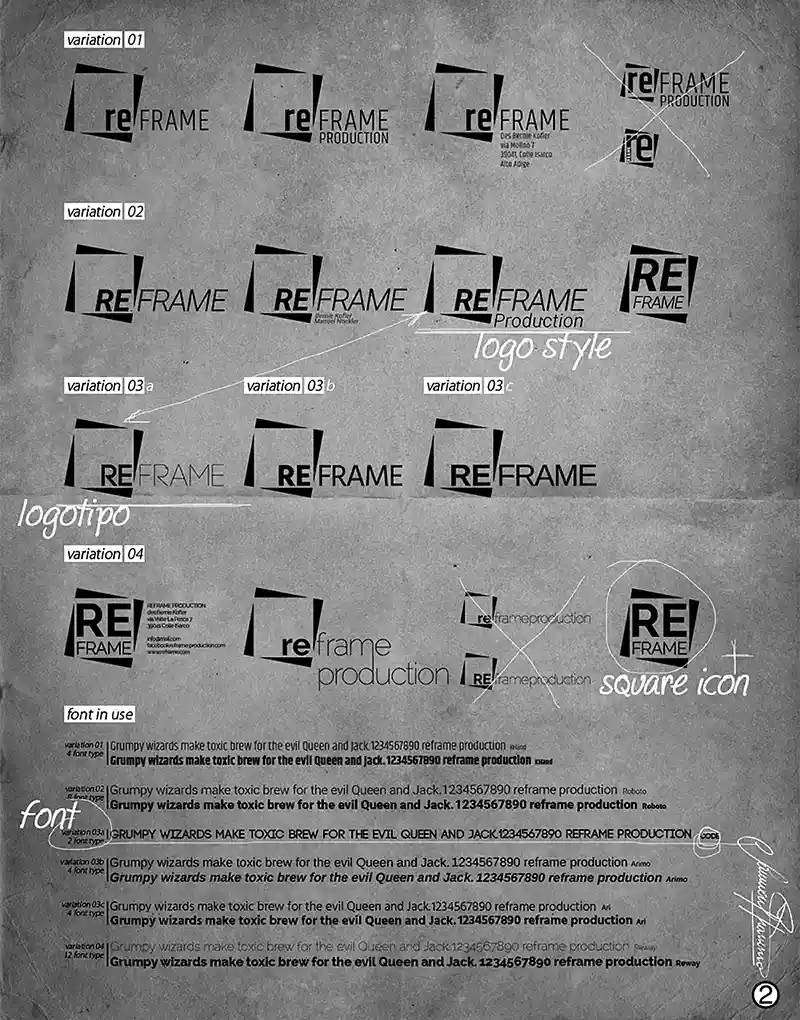
Once the concept has been defined, the work changes again. It is no longer about searching. It is about constructing. Every detail is examined with greater attention. Proportions are adjusted. Spaces find their balance. Typography is carefully selected. Shapes are simplified until every element genuinely contributes to the clarity of the logo.
It is a phase of small adjustments. Changes that are often barely visible. And yet, those are exactly the differences that determine the quality of the final result. The goal is not to make the logo more complex. It is to make it clearer. More essential. More recognisable. Simplicity is rarely the starting point. It is almost always the result.
That is why the tools we use are secondary. Whether the work is done in Illustrator or with another piece of software, the principle remains the same.
The software draws. The designer makes the decisions.
6. A logo does not end when it is approved.
When the client approves the project, the work is not finished. In fact, this is when the logo begins to live its own life.
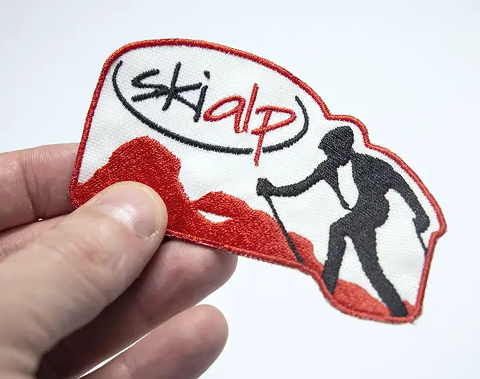
From that moment on, it has to work in many different situations. On a business card. On a website. On a sign. On packaging. On clothing. On a screen or on a printed page.
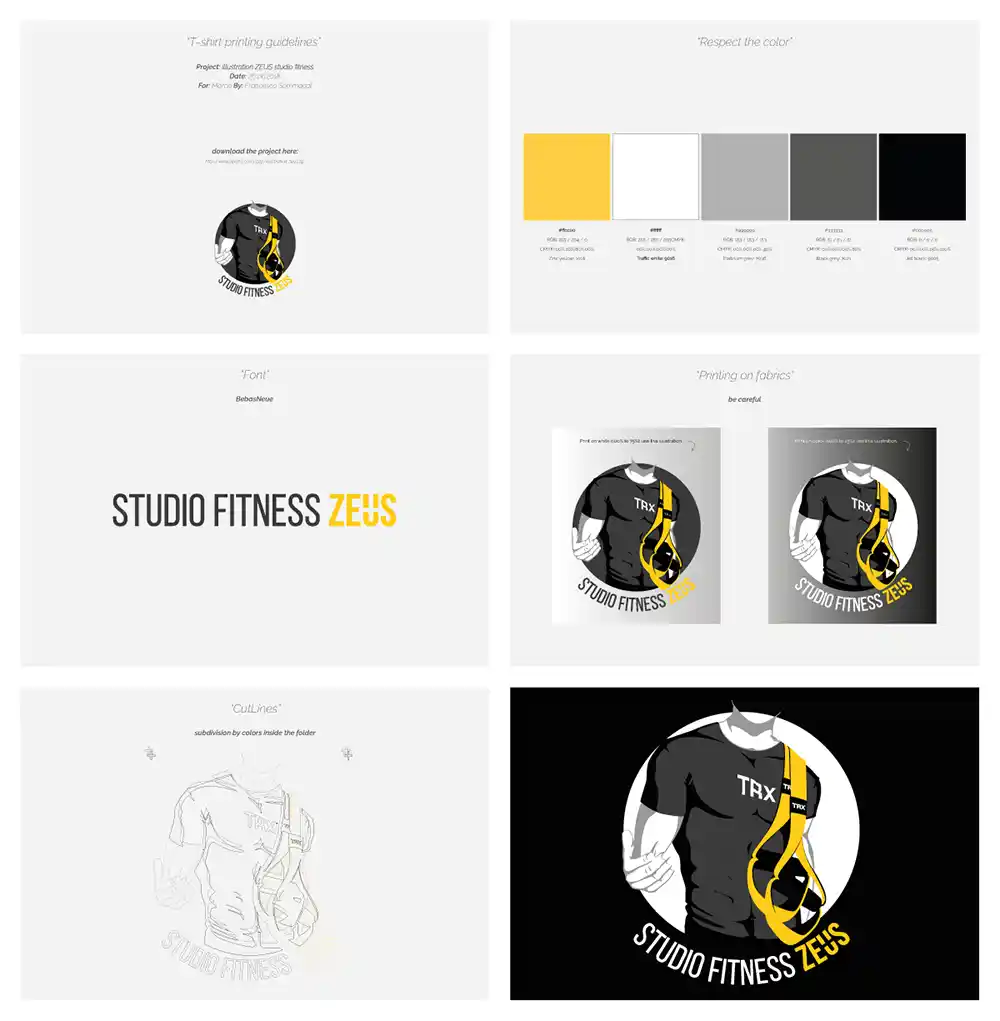
That is why the final delivery is not simply a collection of logo files. I also provide documentation that defines how the logo should be used. Colours. Typefaces. Minimum sizes. Monochrome versions. Correct and incorrect applications.
The purpose is not to impose rules. It is to preserve the consistency of the project over time.
A good logo is not one that looks good on the day it is delivered. It is one that can still communicate with the same clarity and impact many years later.
7. The logo is finished. The work goes on.
A logo on its own does not communicate anything yet. It only becomes an effective sign when it is placed within a broader context. A website. Social media. Advertising. Packaging. Business spaces. Products. Motion. It is through the way a logo is used and repeatedly made visible that it begins to build meaning.That is why the work on a logo does not end when the design is finished. At that moment, a much larger chapter begins: the visual identity and the overall communication of a company.
But that is another story.
What interests me about working with logos is precisely this first step. The moment when nothing is visible yet, and the task is to recognise something that is already there. Because a logo does not necessarily have to represent something extraordinary. Apple is an apple. Nike is a symbol. Coca-Cola is a wordmark. What makes these signs powerful is not just their shape. It is everything that has become associated with them over the years. They have been seen. Seen again. And seen again and again.
A logo does not become recognisable through its drawing alone. It becomes recognisable through its presence. And perhaps that is one of the most interesting qualities of a logo: It does not have to tell the whole story.
It only has to reveal something.
8. See before you draw.
I believe a good logo does not begin when the first line appears on paper. It begins much earlier. In a conversation. In an observation. In a question. In a detail that may seem insignificant at first.
I like to think that the ideas for the future are already floating in the air. They are there before we are able to see them.
The designer’s job is to recognise them, pull them out of the air and bring them onto a sheet of paper.
Then come the tools. The software. Artificial intelligence. Vectors. Colours. Typography.
It only has to reveal something.
They help make an idea visible.
But they do not create the first thought.
Because that is where real design begins.
Not with drawing.
With seeing. I don’t design logos. I discover them

Validation and Prototyping Phase
Do we still need 3D modelling in the age of Artificial Intelligence?