

Skischule Ladurns – Designing Clarity Before the Website
A complex offer, many users, many possibilities. The project started with a simple question: how can everything be made clearer?
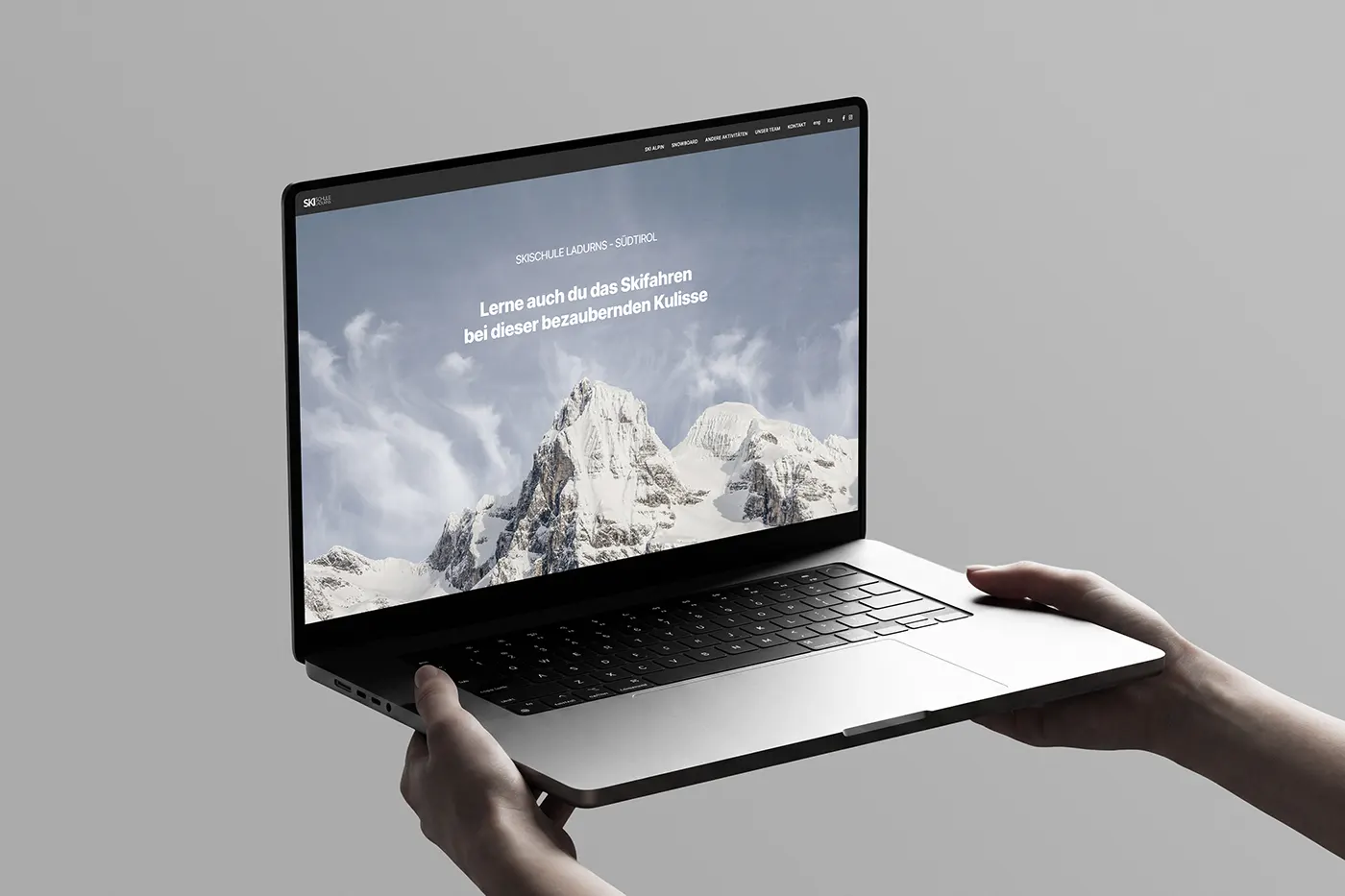
Web design
Client — Skischule Ladurns
Status — Published
Introduction
When I started working on the new website for Skischule Ladurns, the challenge was not simply to have an updated website.
The ski school offered a wide range of activities, but the offer was not yet structured clearly enough. Different courses, durations, skill levels, schedules and participation options overlapped, making it difficult to quickly understand which offer was the right one.
Before designing the website, I therefore needed to understand what the school actually offered and, above all, how these offers could be organized from the perspective of the people who had to choose between them.
The web came afterwards.
Before the website: understanding what to offer
The first phase of the project was not about graphics.
It was about understanding what the school actually offered and how this information could be organized.
The starting point was a long list of activities, courses and possibilities: skiing, snowboarding, children, groups, private lessons, freeride, cross-country skiing, ski touring and other activities.
But the structure was not yet clearly defined. For some offers, the format, number of participants, duration or included services were not immediately clear.
Before designing pages and menus, I therefore worked together with the school to organize the offer and develop a clearer structure.
The goal was not to reduce the complexity, but to make it understandable.
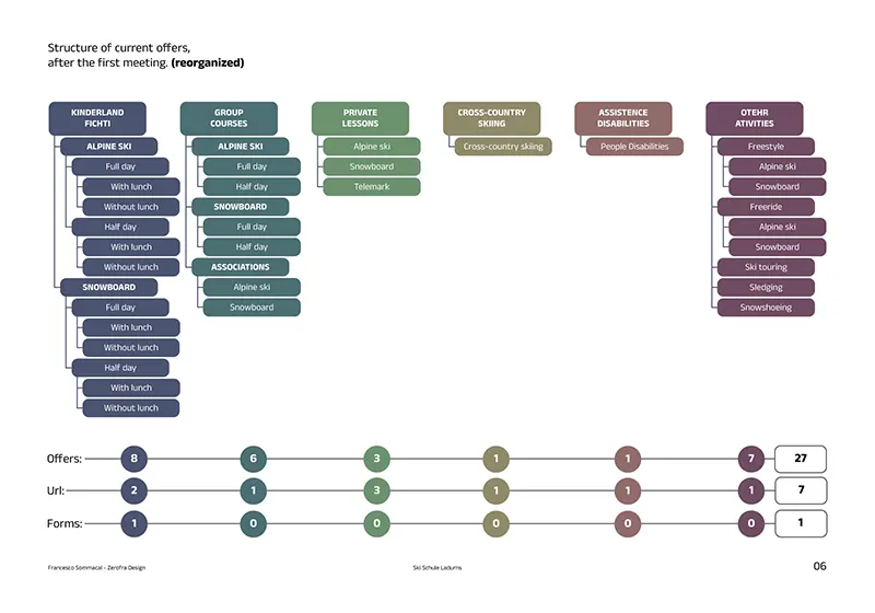
Website structure. The different offers and dedicated pages.
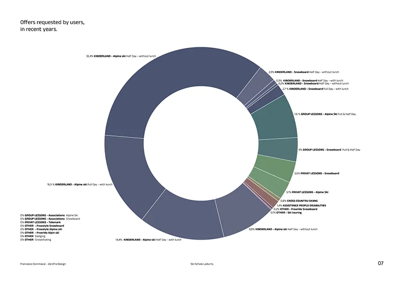
Offers requested from the school over the past years.
The solution: from the offer to the booklet
Once the structure of the different activities had been clarified, the next step was to turn it into a communication tool.
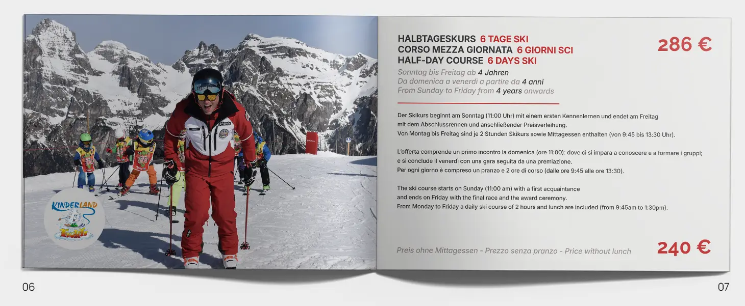
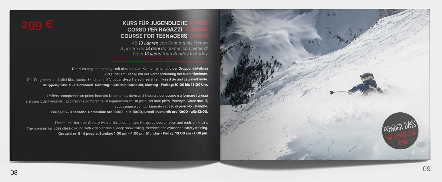
This led to the creation of the school’s new offer booklet.
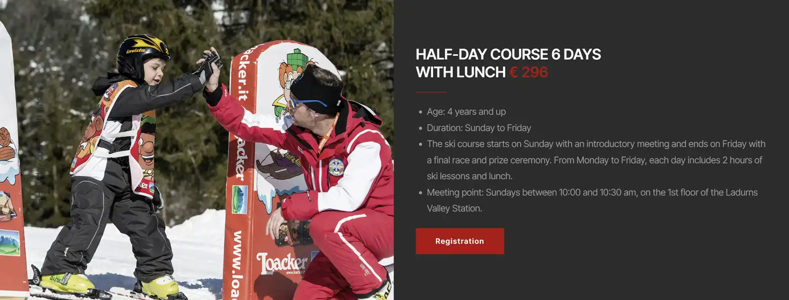
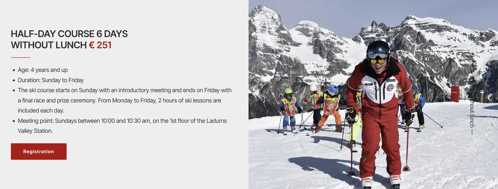
Each offer follows the same logic: an image, a short text and the information needed to quickly understand what the course includes, who it is intended for, when it takes place and how much it costs.
The booklet was not designed as something separate from the website. It became the first reference point for building a consistent communication system.
First the offer. Then the way to communicate it.
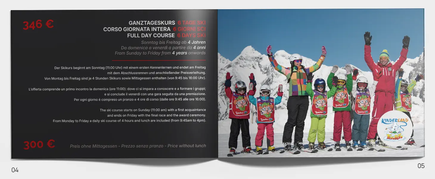
The same structure becomes digital
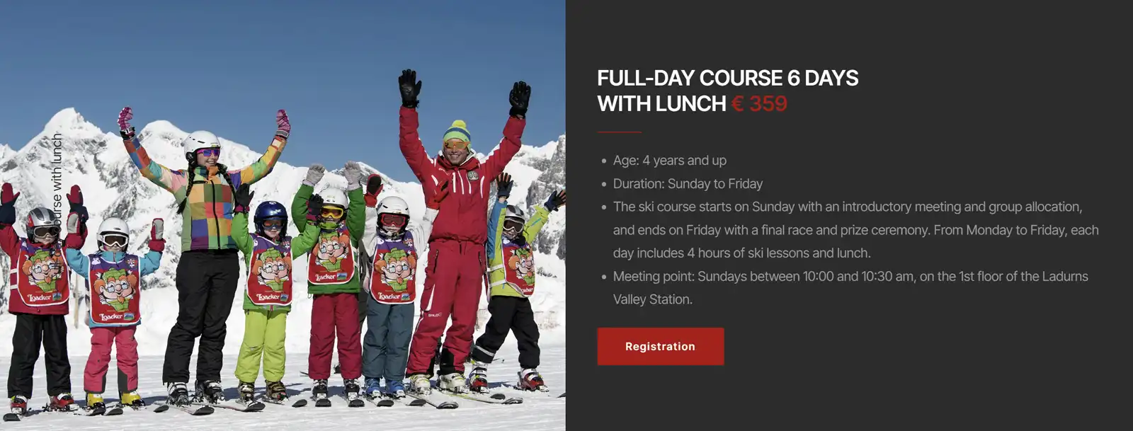
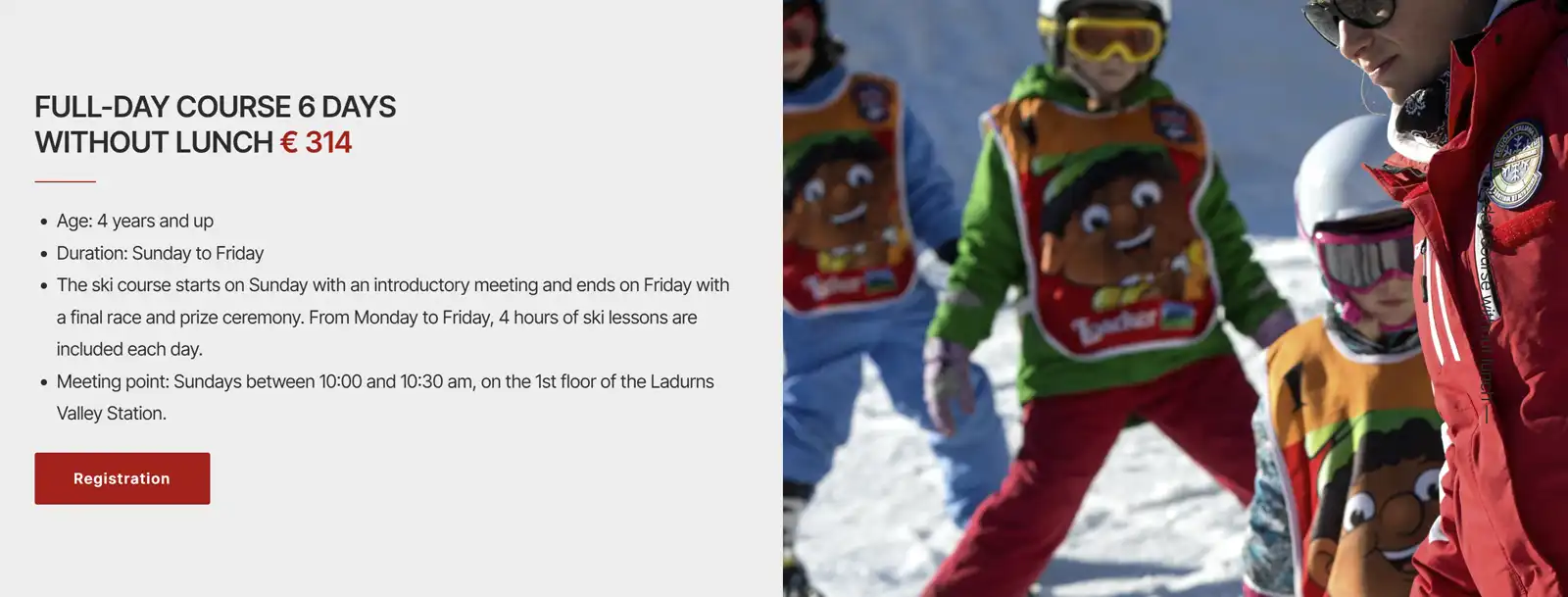
The website grew directly out of this work.
The main structure is deliberately simple: Ski, Snowboard, Other Activities, Team and Contact.
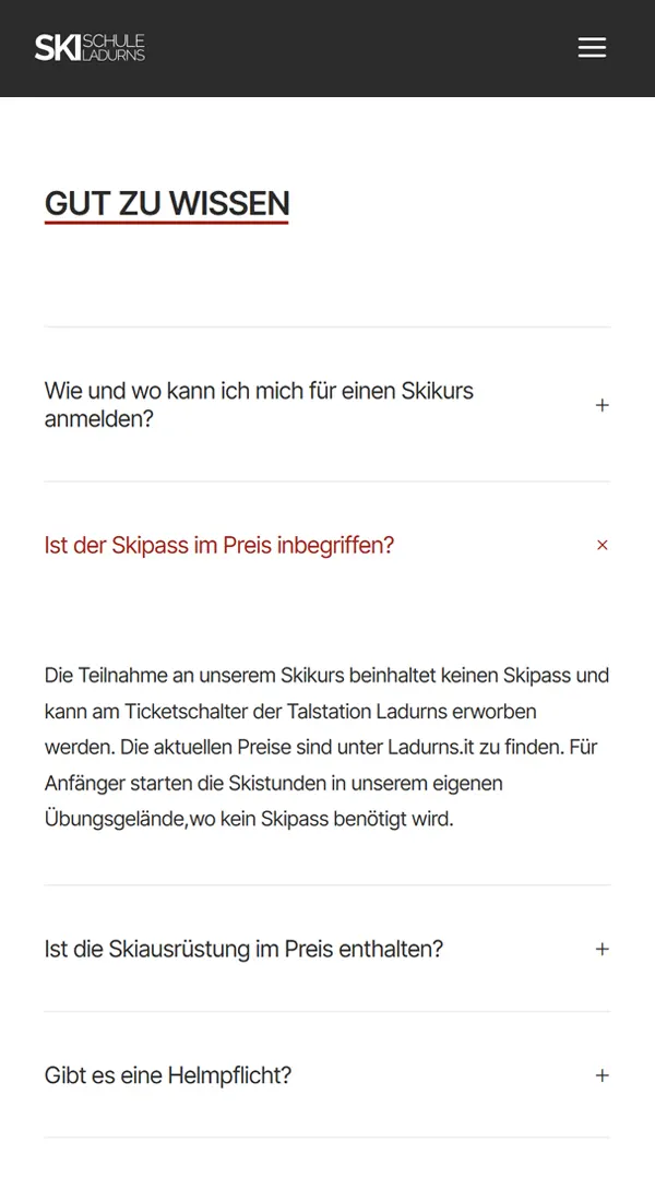
Within these sections, the different offers follow the same logic used in the booklet, with images and concise information organized for quick consultation, including on smartphones.
Web design therefore becomes a natural extension of the structure already defined: not a new system to build from scratch, but the same content adapted to a different medium.
The simplicity of the navigation does not come from reducing the number of offers, but from organizing them.
The project does not try to hide the complexity. It tries to make it understandable.
Not everything needs to be online
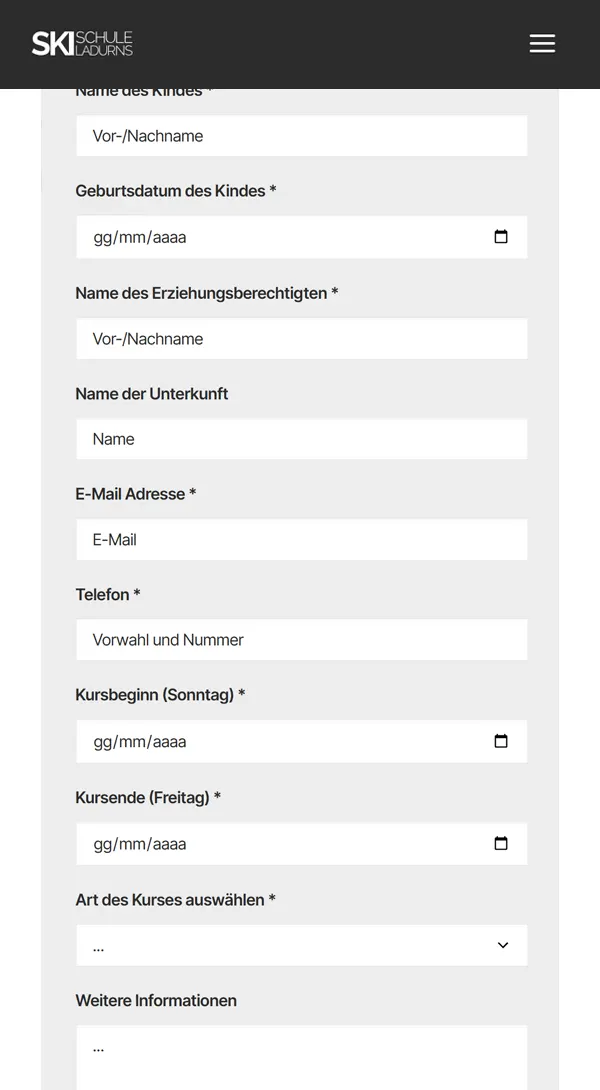
For registrations, I deliberately chose not to introduce an online payment system.
Requests are collected through dedicated forms for the different types of courses and then handled through the usual communication with the school.
A decision based on the client’s actual organizational situation: not every digital tool is necessary simply because it can be integrated into a website.
Designing a service also means understanding which tools are actually necessary.
When design starts with organization
The Skischule Ladurns project began before the web.
Before designing pages, menus and interfaces, it was first necessary to understand how the offer was organized and how it could be presented more clearly.
Moving from printed material to the website made it possible to maintain the same structure across two different media, adapting it to the characteristics of each.
It is an approach I also use in other projects: first understand the problem, then organize the information, and only afterwards decide how it should be communicated. In the case of Ladurns, the result is therefore not simply a new website. It is a communication system built around an offer that, before the project, needed above all to be clarified.

Simplicity does not mean having less to say.
It means knowing what to say, where to say it and when.
With the Ladurns project, the work started with the offer, moved through the booklet and ended with the web.
First the structure. Then the communication. Finally the tool.
Tesone Alimentari – Italy
An e-commerce store managed independently by the client.