
Visual Communication and Video Design in South Tyrol
A visual communication project developed to present a small vending concept through video, graphics and contemporary visual language.
A balance between real footage, 2D animation and art direction designed for social media.
.
Visual Communication
Client — YO!
Status — Published
Communicating a product through rhythm, colour and identity
Problem
How can a small vending concept become recognisable within the fast and saturated language of social media?
The goal was not simply to show the product, but to create an immediate, fresh and memorable visual identity through imagery, rhythm and atmosphere.
Solution
The project combines real footage, graphic animation and motion design into a clean and dynamic visual language.
The video blends 2D elements with real scenes, creating a continuous dialogue between reality and graphics through vibrant colours, simple compositions and lightweight communication designed for social platforms.
Each sequence was developed through storyboards and visual rhythm studies, transforming an everyday product into a contemporary and recognisable piece of communication.
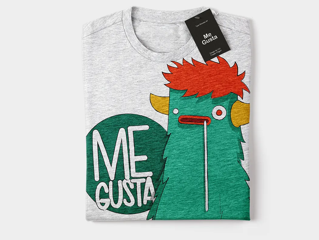
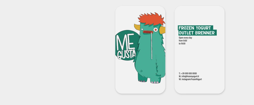
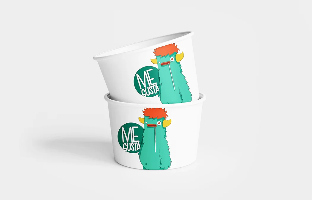
The graphic irony behind the message “Me gusta!” becomes an integral part of the visual identity.
Result
A direct, clear and immediately recognisable visual communication project.
A balance between motion design, storytelling and graphic identity capable of enhancing the product through a simple yet carefully designed visual language.
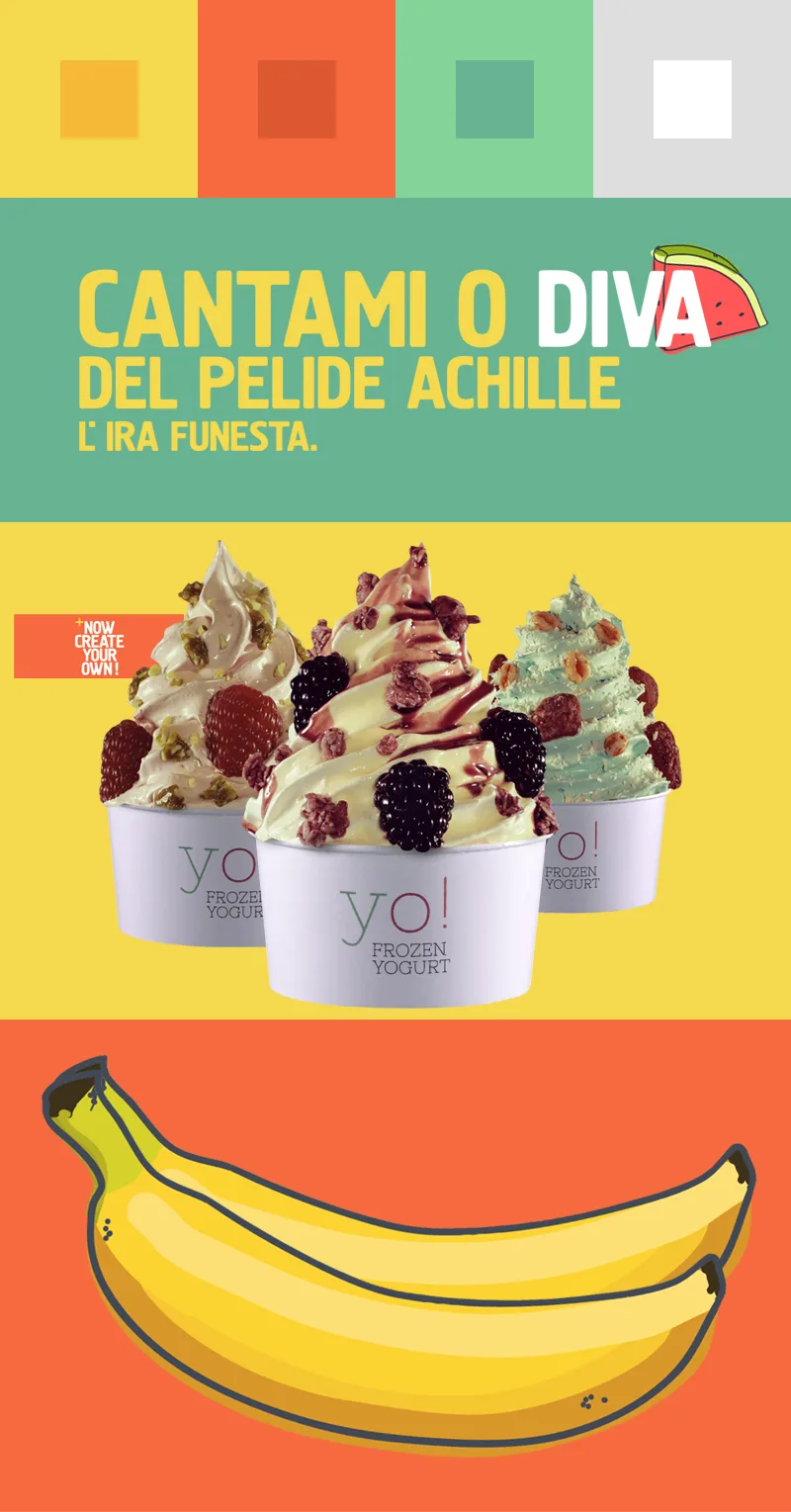
Designed storytelling, not generated
Before animation, the project begins with sketches, storyboards and narrative structure.
Each sequence was manually developed through composition, rhythm and motion design, transforming the video into a communication process built frame by frame — without generative automation, but through a fully design-driven approach.
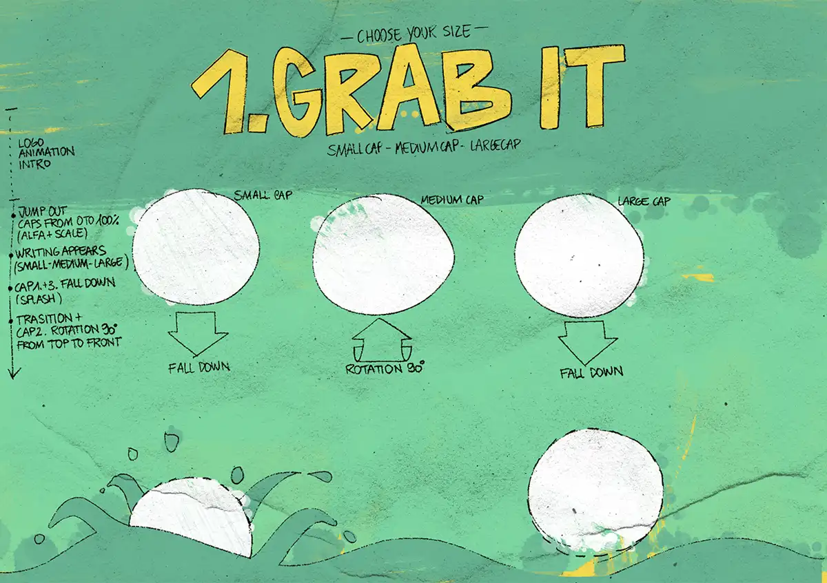
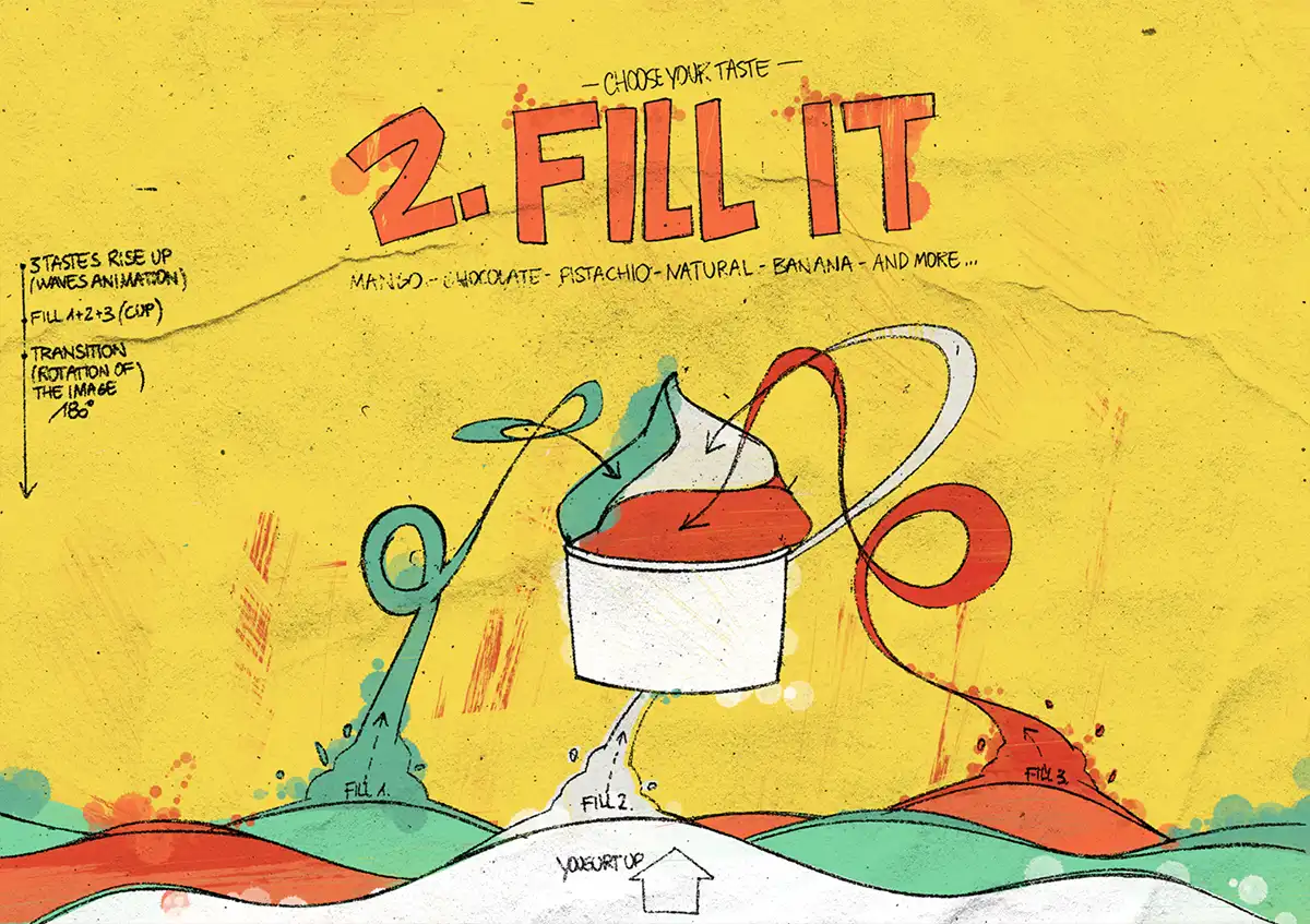
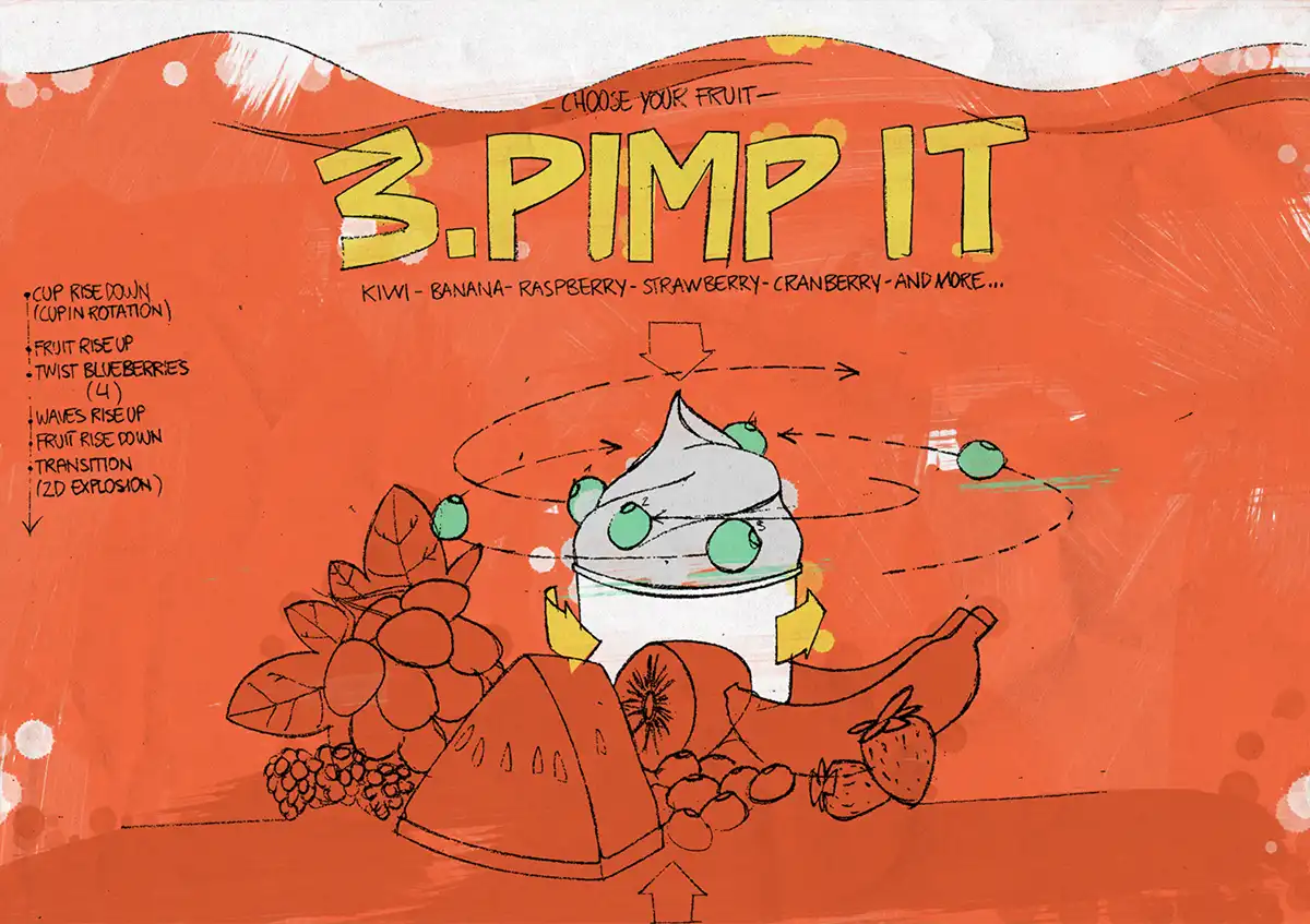
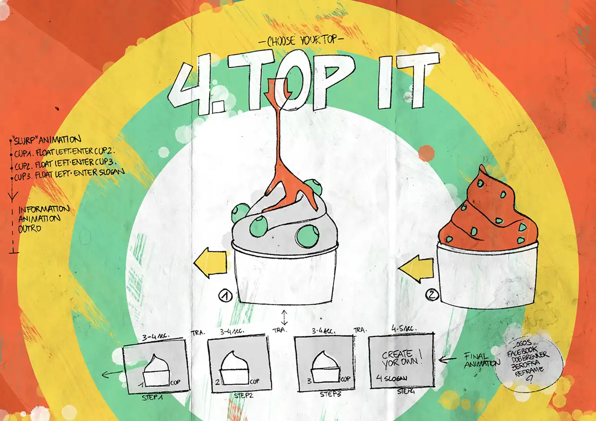
From graphics to motion
The project began with the intention of creating a coherent visual language before animation itself.
Storyboards, composition, colour and rhythm become design tools capable of guiding perception and building an immediate visual identity.
The video combines real footage, 2D animation and motion graphics developed through storyboards and visual design.
Project overview
The project explores the relationship between visual communication, motion design and contemporary social media language.
The objective was not to create a simple promotional video, but to build a visual system capable of giving character and recognisability to a small product through rhythm, colour and graphic simplicity.
The entire project was developed starting from storyboards and visual communication studies, defining atmosphere, composition and narrative rhythm in advance.
A balance between real and graphic
The video alternates between real footage and 2D animation, creating a visual language that feels dynamic yet essential.
Graphics are not used as decoration, but as an integrated part of the visual narrative.
Communication through design
Even though the project dates back several years, the design process remains highly relevant today: creating content through clear visual direction and strong design coherence.
Every element — colour, typography, motion and editing — was designed to communicate immediately within social media environments.
Visual identity and simplicity
The project represents an approach to visual communication based on reduction: removing the unnecessary and building a direct, lightweight and recognisable visual language.
A balance between graphics, motion and storytelling developed through a coherent design process.